Character Design • The Astronaut Research
Style - Tin toy
Trait - Clumsy
 |
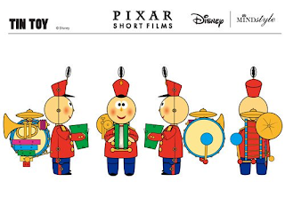
| Fig 1. Tin Toy turnaround |
A thing I'll need to think of is what age group the toy is aimed at to allow appropriate colouring, a young child would want loads of colours, an older one nearing the teens or older would like something a little more realistic.
Again thinking along the age for the toy would be its simplicity and moving parts, a young child would need something with little choking hazards, a durable toy. The older the child the more careful they are with their toys, allowing more moving parts.
Looking at 'Vintage tin toys from 1900s to 1960s' on a website called Carters, I was comparing Tin toys, most have little to no movement, some just have a single bar or pin and a thin gap to allow simple twisting motion.
Looking at some Tin toys they can have keys to wind up for a simple motion.
If the motion of the toy is to waddle forwards there are two bits on each foot so the toy has more balance whilst moving forwards.
I want to make a fun looking character.
- The colour scheme needs to be simple yet appealing.
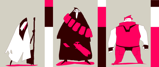
I could use something like the 60-30-10 rule to help with the planning before adding more detail.
Fig 3. 60-30-10 rule - The characters shape should be rounded
The character is not evil so triangles are not very good to use, but also on a toy is a bit of a hazard. - Face wise I won't need to do much, the face could be behind a screen but then I'd need to find a way for the character to express emotions
I could place simple eyes on top of the screen covering the face for simple expression.
Pixar's Tin Toy (1988) https://www.disneyplus.com/movies/tin-toy/5R22xupX16it
The history of Spacesuits - https://www.nasa.gov/audience/forstudents/k-4/stories/history-of-spacesuits-k4.html
Fig 1. Tin Toy turnaround - https://twitter.com/HistoricDisney/status/814968250119254016?s=20
Fig 2. On July 16, 1969 - https://www.nasa.gov/centers/kennedy/about/history/timeline/60s-decade.html
Fig 3. 60-30-10 rule - https://embed.tumblr.com/embed/post/gNBPyThDi-vSyB1J10QyDQ/154805921182
More Images from Nasa - https://www.nasa.gov/content/nasa-history-images-archive
'Vintagetin toys from 1900s to 1960s' - https://www.carters.com.au/index.cfm/index/8316-tin-toys/
Kmart tin toy search - https://www.kmart.com/search=tin%20toy


Comments
Post a Comment